Food System Stewards
BRANDING
The Project
Food System Stewards helps nonprofits accelerate the shift toward plant-based eating by securing "counterfactual" funding – that is, new revenue they wouldn’t have reached on their own. Recently launched through the Kickstarting For Good incubator, the organization works to diversify income for high-impact groups to ensure long-term stability. They needed a fresh visual identity that stands apart from typical vegan advocacy org branding.
Our Approach
We first guided Food System Stewards through naming and brand strategy to build a rock-solid foundation. From there, we brought their vision to life with a visual identity rooted in the metaphor of stewardship. Leaning into nautical imagery, the result is a brand that feels strategic and intelligent, yet warm enough to ensure clients feel welcomed and supported rather than intimidated.

Primary colors
Logo Design
The logo centers on a sailboat with a leaf in place of a sail, symbolizing the leadership and stewardship Food System Stewards provides to the animal advocacy movement. While the clean, modern mark conveys competence and forward-thinking, the waves beneath represent the tumultuous seas the organization must navigate to succeed. Designed with a strong sense of motion, the logo captures the energy of wind in the sails and the steady momentum of a vessel moving forward.
Color Palette
We explored a few color directions before landing on a “mixed berries” palette that intentionally departs from the cool tones typical of the movement. This palette features inviting raspberry, grape, and blackberry hues, balanced by a contrasting gooseberry green. To ensure the brand feels approachable rather than intense, a soft snowberry tone serves as a grounding neutral to keep the overall aesthetic soothing and professional.

Secondary colors

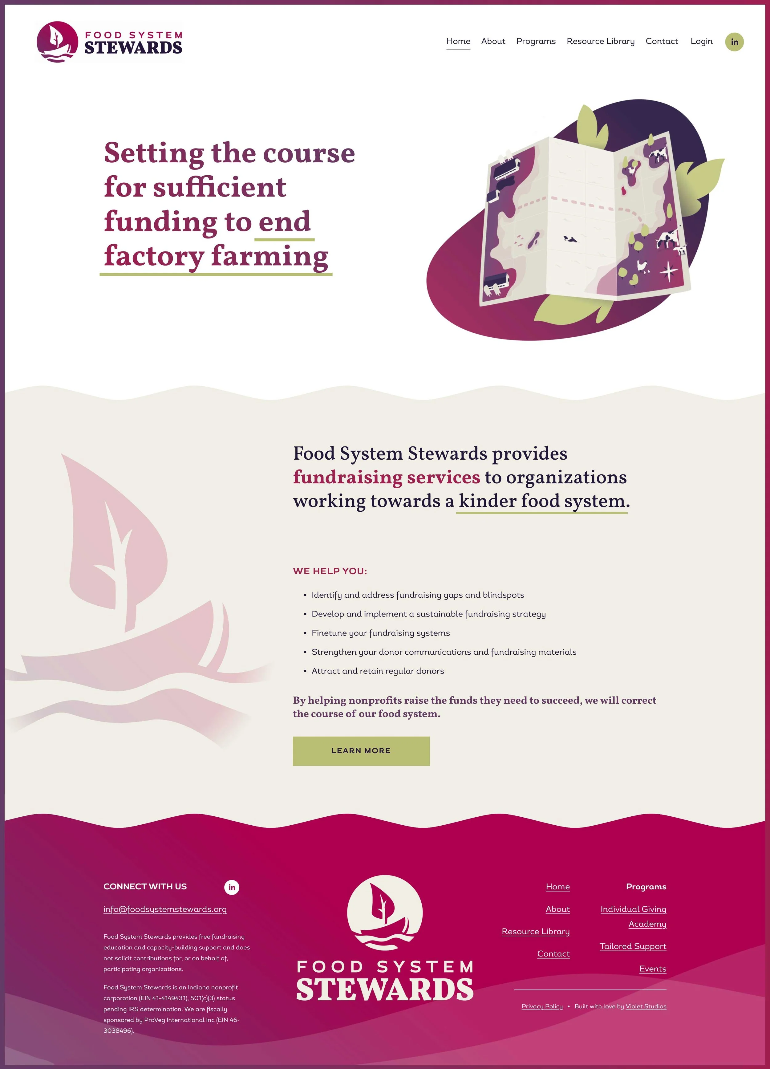
Website Design
The website translates the brand's nautical identity into a clean, purposeful digital experience. Custom icons and illustrations carry the playful, approachable spirit of the brand throughout, breaking up denser content and making complex fundraising concepts easier to digest. The overall layout balances professionalism with accessibility: crisp typography and structured content sections convey credibility, while the soft neutral tones and illustrative elements keep the experience inviting rather than corporate.
Custom Icon Set & Illustrations
To enhance the website, we developed a custom set of icons and a hero illustration that transform complex fundraising topics into accessible, engaging content. This playful illustration style provides a creative counterpoint to the website’s crisp lines, softening the overall aesthetic to make the brand feel more approachable and inviting.
“Working with Violet Studios was an absolute dream. Their team took the time to understand our project, brand, and personality—and then brought it all to life. They helped us refine our name, develop our branding, and build our website, exceeding our expectations at every step. They didn’t just understand our vision; they proactively expanded it and delivered ideas we hadn’t even considered.
As a startup, our name, branding, and website were critically important. Without Violet Studios’ generous pro bono support, we wouldn’t have been able to afford anything remotely comparable.”