
AI design tool evaluations and how they're influencing trends, updated: November 6th 2026
Kate Rodman, Executive & Creative Director of Violet Studios
Our creative team has gotten one question a lot in recent years: well, what about using AI for this? It comes up around websites, documents, social media graphics, ads, and more. I want to lay all the cards out and explain what's behind this question, why this discussion with clients (and you!) matters to us, and what the tools can and can't do when we test them on everyday design work at this time.
The short version: We tested eight AI models on everyday design tasks, and rated over 100+ results. None of the first attempts were ready to publish. While Claude and ChatGPT models performed best and Google Gemini came out worst, every tool did better with a strong brand kit in the prompt than without.
Who this is for: Mostly the people already using AI for design: non-designers at organizations with no budget for a designer. Designers can already do this work, and still do it better. We know that some of you may decide to use AI for design outside of our recommendations, so we’re presenting how to use AI for design with appropriate guardrails and tips for identifying red flags in the output. This is a guide for when AI for design is permissible and where you should still draw the line.
Why I'm writing this
At Violet Studios, we've been seeing animal advocates use AI for design in ways that hurt their brand and their message. Teams are leaving opportunities for connection with their audience on the table, and potentially damaging that relationship irreparably.
What one organization puts out to their audience may also reflect on the whole movement and shape how the public feels about our work – making it harder for other vegan and animal groups to be taken seriously, too.
We want the movement's message to stay strong and trustworthy, not get lumped in with AI slop flooding the internet.
What's happening with AI-generated design and content right now?
AI has what researchers from Harvard Business School and BCG called a “jagged frontier”: it’s impressive at some things and struggles with others. If you've tried AI for design, you've probably felt this firsthand – that lightning in a bottle effect, where you occasionally get impressive results, and other times you get something unusable.
AI-generated design is rampant on social media and websites, posted quickly to fill content needs, regardless of its quality. Internet culture is always changing, but this wave is a big one, and it's reshaping how audiences experience all content, not just yours. This is causing feelings of fatigue for users on every platform, diminishing engagement for everyone.
So the question is: how do we keep this phenomenon from undermining what the vegan and animal advocacy movement is trying to do – move even more people to engage and act, change systems, and build coalitions?
We believe it comes down to human judgement.
We’ve determined one critical factor in generated designs with AI: the output is only as good as the judgment of the person driving the tool and reviewing what it makes. This is still true across almost every utilization of AI, not just with design.
If you use AI for work that takes expert taste, the output can be bad in ways you can't recognize as bad. These AI-generated “tells” are referred to as the “unknown unknowns” for non-designers, and when left unaddressed can make the final work feel amateur or underdeveloped in ways that will reflect poorly on the person who delivered the work, not on the AI tool.
As AI design output improves over the next couple of years, that need for judgment isn’t going away. For some outputs, you can sharpen your own eye, but for other types of output, you'll want someone with design expertise to review it and make adjustments.
Why does design quality matter? We’re a nonprofit, isn’t it good enough?
This question definitely predates AI – it just matters more now. Especially in “nonprofit-land” where something that looks low budget is often viewed as justifiable. The truth has always been that the quality of your design shapes the impact of your brand and how audiences perceive your message. Period.
What do you stand to gain from high-quality design?
Trust. Consistent design experiences build trust in your audience. Conversely, audiences read a lack of attention to detail as a sign you can't be trusted. Small mistakes add up over time and shape how your organization is seen online.
Narrative. Stories drive decisions more than data alone. We as a movement have the facts on our side, but we've seen that facts aren't enough on their own. How information is delivered decides whether it's believed, felt, internalized, or even remembered.
Memorability. When everyone's design looks the same, nobody stands out. Differentiation is what helps us stand apart from every other organization or business posting on social media, and it's critical for our success.
Connection. Movements are made of people, and the point of your content is to build trust and connect with them. This matters, so let’s look at it more closely.
Prioritize connection by making good design a priority.
When people can identify a piece of content as AI-generated, they all subconsciously sense that it’s not you speaking. Any anxiety that they associate with AI gets transferred onto your decision making and may distract from your message.
For mission-driven organizations, authentic connection is what separates us from corporate industry, political propaganda, and general internet noise. It’s a strength we should lean into whenever we can.
The way you communicate your message matters as much as the message itself.
"People will forget what you said, people will forget what you did, but people will never forget how you made them feel." – often attributed to Maya Angelou
Design is a huge part of how people feel about your message, your organization, and our shared mission. Do you want people to walk away moved to act, convinced, and empowered? Or do you want them to forget about you? Even when they might not be able to articulate why, design shapes how people engage.
How audiences react when they notice design is AI-generated
In our experience, the AI “ick" is stronger for creative work – especially visual art – than for almost any other application of AI and it usually garners a strong negative reaction.
Yes, humans have a bias for humans and their work! We're highly social creatures, and we'd rather be interacting back and forth with other humans than robots. Recent research backs this up:
In a study by Bellaiche et al., people rated the same paintings as more likeable, beautiful, profound and valuable when they were labeled “human-created” than when they were labeled “AI-created” – even though every painting was actually made by AI. Your work may not carry a label, but audiences can often tell on their own when design is AI-generated.
Another study describes an "AI disclosure penalty": Humans consistently devalue content once we know AI made it. So when your audience recognizes AI in your content, they may dismiss it automatically.
Ultimately, if we want our messages to land and our brands to be respected, loved, and remembered, we can't afford to be unstrategic about our utilization of these tools and their outputs.
“But can non-designers really tell the difference?"
I get this question a lot. It isn't so much about whether people can articulate those differences, but they may disengage or express distaste in other ways.
Part of this is because of pattern recognition. Our brains from an early age are very good at it: see something similar a few times and you pick up on it, consciously or not. AI-generated graphics share a lot of the same patterns, and we see them so often – when they fill the feed with too much sameness, we lose interest and keep scrolling.
Moving forward: We are working to define successful use of AI in design
Using AI for content has different requirements for success than using it for other work.
If AI has helped in other parts of your work, it's natural to look for more places it can help. And many teams are short on capacity for content, so it's high on the list of things leaders wish they could hand off to a more efficient process. We're seeing a lot of groups try this, with mixed results.
Let’s start with how design is intended to be leveraged in our space, typically:
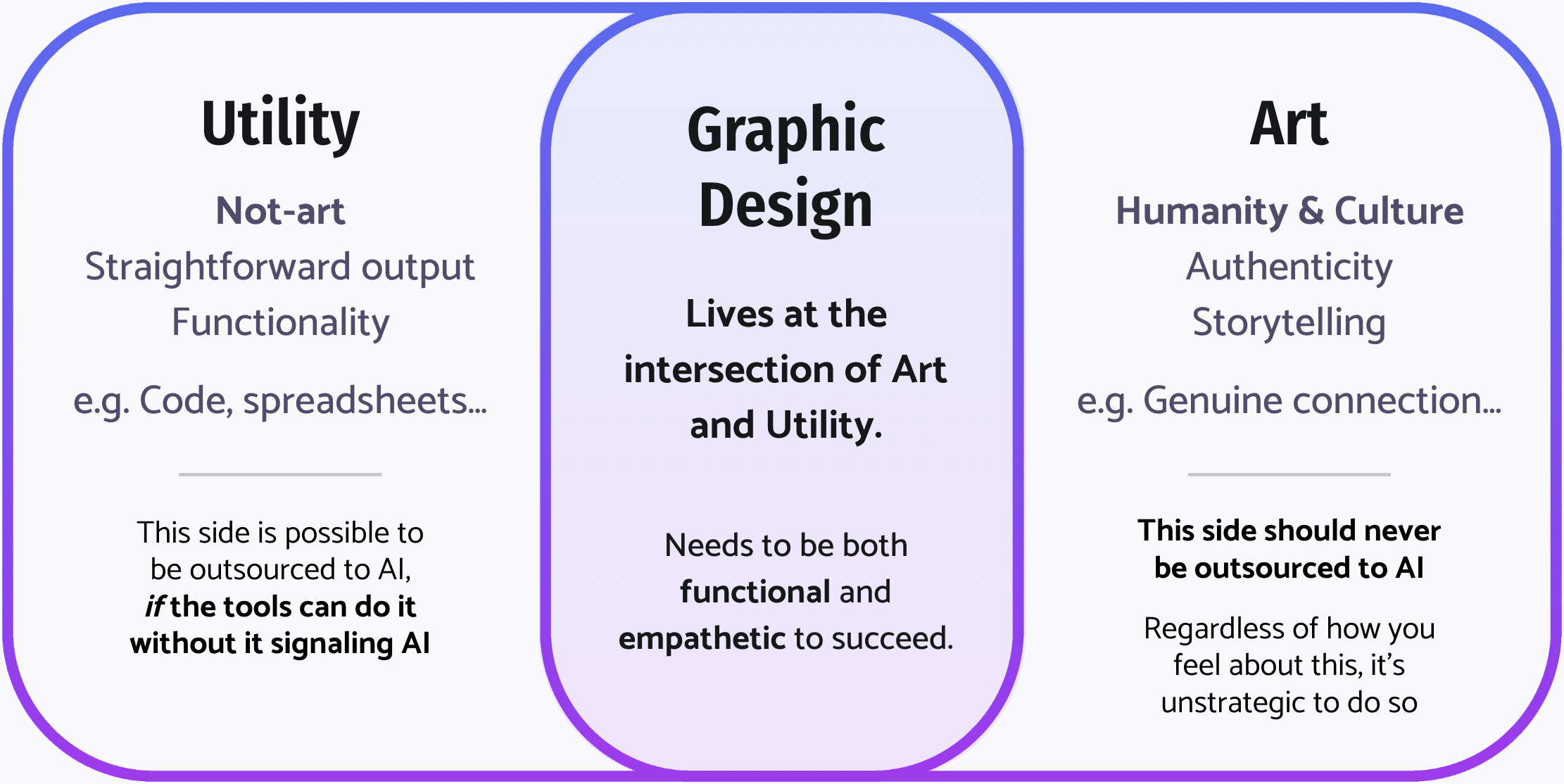
Utility is the “not-art" stuff: code, spreadsheets, math. If it checks the box, it's done. This side can be handed to AI, as long as the tools do it accurately and the result doesn't smell like AI.
Art is the human side: humanity and culture, authenticity, storytelling, the things that make us feel alive. It's the real connection and collaboration with partners and allies, and the feelings we attach to creative expression. This side should never be outsourced to AI.
Graphic design lives in between. It's creative strategy with a function, so it has to be both functional and empathetic to succeed.
Maybe you’re reading this thinking, “AI art is great – what’s wrong with it?” Even if you like using AI personally, handing the art side of your advocacy work over to it is a strategic risk. At worst, you end up with “slop” that damages your message. At best, you miss a chance to reach more people through real human-to-human connection – the thing that people crave and the one that stands out more as AI content fills the feed. Ignoring that is a big opportunity cost: we lose the power of connection for movement building.
Slop, tells, and the risk to your brand
We've all heard the word “slop." It refers to obviously low-quality AI output of all kinds, but particularly visuals. It likely looks terrible and barely serves the intended function, if at all.
“Tells" are more subtle. They're the visual habits that AI tools have collected that lead an audience to be able to clock right away that something was AI-generated. Think of what happened to the em dash in AI-written text: nothing is technically wrong with an em dash, but after several years of em dashes in every single LinkedIn post, it signals to a reader that the content is “fake” and may disengage. Design has these tells, too!
Here's why both AI “slop” and “tells” matter:
Slop harms your credibility. It aligns your message with spam, and it can drag down the credibility of the wider vegan and animal advocacy movement. If the choice is between posting slop and not posting, we’d strongly recommend against posting the slop. But those are rarely the only two options – a basic free Canva template could get you where you need to go, without the risk.
Tells make you invisible. Even when the work isn't “bad," it blends into the sea of AI output online. Being forgettable isn't the goal of anything we make at Violet Studios and it shouldn’t be yours.
Online, your content is you. It's judged as your brand, with no benefit of the doubt. The internet doesn't distinguish between “AI made this" and “we made this." Everything you post under your name either holds you back or moves you forward.
Testing the most common AI tools for design
We wanted to answer a practical question: can animal advocates realistically use these tools for their day-to-day graphic design needs, or not? To find out, we partnered with our sister organization, Vegan Hacktivists. They brought their technical expertise, setting up the testing environment and keeping it sound, e.g. by controlling for anything that could skew the results and writing clear, specific prompts for each test. Our role was to bring the design expertise and evaluate the outputs. Shout-out to Mike Wigmore especially, for his technical guidance here!
How we narrowed it down
We chose the models folks are most likely to be using. The world of models, reasoning levels, and context options explodes this question wide, so we narrowed in on a few priorities and evaluated just over a hundred results (not thousands). All tests ran between October 15th and November 6th, 2026. We have no paid relationship with any of the companies that own these products.
We tested eight models through agent tools (Claude Code, Codex, and Ori Code for Gemini):
Claude Sonnet 5.5, Opus 5.5 and Fable 5.1
GPT-6.1 Terra, GPT-6.1 Sol and GPT-6 Astra
Gemini 3.8 Flash and Gemini 4 Argon
We ran the models under controlled conditions so the comparison is fair; results in the everyday chat apps may differ. Every design was made in a fresh session with the same files and tools, and we checked the logs to confirm no model had extra help.
Our parameters for the tests
We assumed a non-designer would be using the tool, meaning we tested prompts that a non-designer might write.
Each tool received context in a folder along with the prompt: a brand guide and logo files, used with the designer's consent. For this test, we used a brand I created five years ago for Vegan Linguists, a Vegan Hacktivists project that has since been retired as AI translation improved.
We ran 6 common design tasks across documents, social graphics, and web: a 300×600 web ad, a strategic plan document, a theory of change document, a quote social post, a landing page, and a flyer.
Each task ran in two scenarios:
Scenario A: a simple brand guide and logo files.
Scenario B: a more complete brand guide and logo files, plus branded patterns, textures, custom illustrations, and other elements.
That's 12 tests per model.
I (Kate) rated every result without knowing which model made it. Each one got an overall rating out of 5 (based on overall quality, how well it applied the branding, and if it had any mistakes), plus tags for common problems (e.g. logo used incorrectly, patterns broken, stray lines or shapes, other AI tells). I designed this brand, so I know its rules better than anyone – which makes me the best judge of whether a result is on-brand. It also means I’m close to it, which is why the ratings were blind.
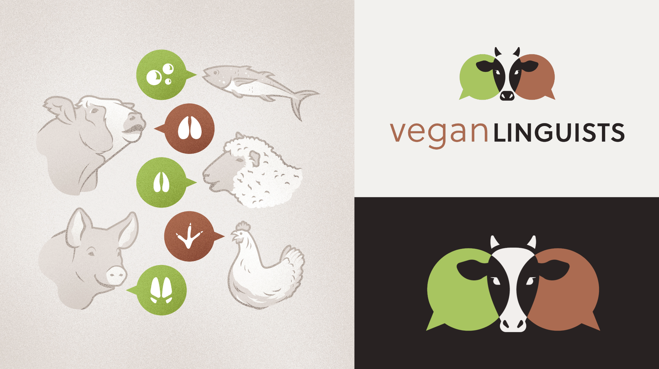
A sample of the brand assets from Vegan Linguists provided for the testing – custom-made illustrations included.
Overall conclusions
More context made every tool better. All tools performed better in scenario B. The strength of the brand and context drives the strength of the results, so the more examples you can provide, the better.
Model choice matters most for the first pass. But no first attempt was ready to publish without edits. Each one needed further prompting by a trained eye to remove the AI tells and slop signals, and/or a designer to elevate it.
Results after one prompt
How did each model do with just one prompt?
| Model | Avg scoreout of 5 | Needs fixesnumber of tests | Not usablenumber of tests |
|---|---|---|---|
| Claude Sonnet 5.5 | 2.92 | 11 | 1 |
| Claude Fable 5.1 | 2.75 | 12 | 0 |
| GPT-6.1 Sol | 2.63 | 12 | 0 |
| Claude Opus 5.5 | 2.58 | 10 | 2 |
| GPT-6 Astra | 2.50 | 10 | 2 |
| GPT-6.1 Terra | 2.21 | 9 | 3 |
| Gemini 3.8 Flash | 1.83 | 8 | 4 |
| Gemini 4 Argon | 0.91 | 1 | 10 |
The top six models are close – within about 0.7 points, on 12 tests each – so we wouldn't read too much into the exact order. Sonnet came out on top even though we expected Fable to, and the differences between Claude and ChatGPT were marginal for these tasks.
The bigger choice is which model family you use. The results say go with Claude or ChatGPT, and skip Gemini. Gemini 4 Argon in particular scored far below everything else.
This may be part of why we've been seeing low-quality outputs across the movement. Gemini is included at no cost in Google Workspace for Nonprofits, so it's an easy default, but it's showing up in our tests as the weakest option for design.
Improvements after a second prompt
We took the best result for each task from the first round (with full brand context and assets) and gave it a second prompt to clear out the slop. Each row uses whichever model did best on that task, so this table isn't another model ranking.
| Design | Model | P1 → P2score out of 5 |
|---|---|---|
| 300×600 web ad | Claude Opus 5.5 | 4→5 |
| Strategic plan doc | Claude Opus 5.5 | 3→4.5 |
| Theory of change doc | Claude Sonnet 5.5 | 4→4.5 |
| Quote social post | Claude Fable 5.1 | 3.5→4 |
| Landing page site | GPT-6.1 Sol | 3.5→4 |
| Flyer doc | GPT-6.1 Terra | 4→3.5 |
All but one design improved. On the flyer, the model misunderstood the feedback and the design got a bit worse – a good reminder that more prompting doesn’t guarantee a better result, and part of the judgement is knowing when to stop.
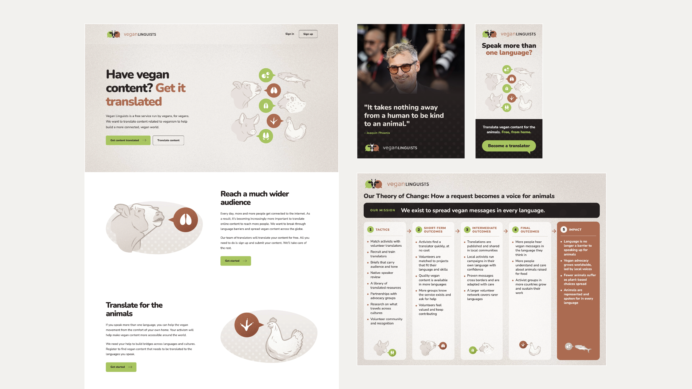
A few samples of the outputs (see full versions up close by clicking above).
A note on our limits: AI tools give different results every time you run them, so treat this as a snapshot from fall 2026. We’d love to see others run similar tests on their own brands, and we’ll keep updating this resource as things evolve.
Design tasks and recommendations
Document designs
The models have improved enough this year that you can create a document base with relative ease. But there are some red flags to look for:
Make sure your text isn't altered. AI tends to add extra text, especially eyebrow text (those little pre-headers). Make sure the voice is still your own and hasn't been edited without you noticing.
Push past the plain default. The typography is pretty standard, and results can be quite plain. Even if the document meets a certain quality bar, chances are high it'll look exactly like someone else's AI document. Take extra care to customize it, and don't just go with the first response. For high-impact public reports or first-impression, donor-facing documents, work with a designer to really drive your message home.
Add images that make sense. A big reason these documents look bland is a lack of imagery. If you don't upload photos or ask for images, you'll get a particularly plain text document. Be careful with AI imagery – it likes to add graphics that don't fit the content, broken shapes, or charts that strongly signal AI. Make sure images stay on-brand. If you can't tell for yourself, work with a designer instead.
Bring the PDF into Canva for hands-on adjustments. If you can't get where you want to go with prompting and you're itching to make direct edits, you can upload the PDF to Canva and edit there.
Social media graphics and web ads
This category has the highest risk of your organization going invisible in a competitive attention economy. Standing out on the feed and catching attention is the main job of these posts, which makes customizing them all the more important. Some key points:
Make sure there are no brand mistakes in the results. We've seen altered logos, misspelled URLs, and other branding mishaps. These posts are the “lights are on" signs of life for your brand – where you connect with people every day. Don't let them look clumsy.
Elevate the basic output. You want variety in your feed while staying within your brand guidelines. This is the hardest thing to do if you're not a designer – don't be afraid to ask for help. A more complete brand kit helps, but it's not a guarantee. In our tests, the tools used brand elements fairly randomly unless told exactly what to do with them.
Avoid looking like spam. Slop is especially common on social media, and it has a recognizable look. Avoid obviously generated images such as animals with huge tear-filled eyes, or fake rescue scenes. Avoid text that’s hard to read, or cluttered layouts full of banners, icons, and sparkles around a bold headline that doesn’t say anything. When a vegan message looks like that, people lump it in with the spam they already scroll past, which is a quick way to be dismissed entirely.
Websites
Your website is your organization's home base, and it should represent the best of your brand. We're noticing that everyone's websites are starting to look very similar. Following common UX patterns is often the right move, but your brand shouldn't feel exactly like everyone else's. You want a website people enjoy, remember, and come back to, and to carry that goodwill over to your work.
Add images that make sense. Just like with documents, if you design a website with AI – Claude especially – the default result has no images unless you provide them. We see image-less websites coming out often these days, and that's usually not a strategic, intentional decision. It just happens, and people don't push back on it as often as they should.
A note on platforms. For now, especially for non-tech-savvy folks, we still recommend an all-in-one platform like Squarespace. Security is handled for you, and non-technical teammates can update the site easily. The platform can also grow with you as your needs change, and you can still customize design and functionality with code blocks and CSS if you’re a more advanced user. If you're not sure which platform is right for you, we're happy to talk through the options before you invest in one – just reach out. This space keeps rapidly evolving, and we'll update our guidance as it does.
In short: Please, do something different. On purpose. If you can't do this yourself, this is exactly what designers are trained to help with.
The future of graphic design
Polished is now the baseline → Lean into human-feeling work in order to elevate
Design and marketing trends are moving away from polished appearances and toward outreach that feels human. When polish gets easy to produce, it stops standing out. Authentic, human work is getting rarer, which makes it more valuable and more eye-catching.
AI makes content cheap, but audience trust is still expensive → Bring in experienced designers for the high-risk work
Work with an experienced designer and strategist to set the human foundation for your brand, so you know you'll connect with your audience. The value of design hasn't changed: you want to stand out, earn trust, and have your messages land.
Taste is still everything → Train your eye to stop the slop
AI is the tool, not the Creative Director. Posting slop can damage the movement's reputation online – not just your own brand, but other vegan brands your audience might associate with your content. We want to lift the quality of our content as a whole! If you use AI for design, you need to be able to judge the output, and then prompt out the slop or hand-edit the mistakes. You're accountable for everything you post. Here are a couple of resources to start with, to notice the slop signals:
AI mistakes are judged more harshly than human ones → Catch them before you post
AI-looking design is overwhelming audiences, and it's tied up with their fears about AI. Human mistakes in design are starting to be viewed more kindly than AI mistakes. If a human designer makes something full of mistakes – or, at the extreme end, a hand-drawn crayon sign – it at least signals there's a person behind it, and viewers can connect with that.
When general audiences see lazy design that's clearly AI, it tends to land worse. They attach their broader feelings about AI to it instead of connecting with the design. I find this fascinating: there's now a level of design that's perceived as worse than a lazy, bad Photoshop job.
Where we're headed next
Violet Studios will continue to be a resource for expert design and creative strategy, at no cost to you. We're leaning into the connective, movement-building work that helps the movement's efforts land with real people – the general public, policymakers, and other stakeholders shaping the food system.
We're also looking for ways to help you make your messages land with the limited resources our space has. We're working on tools and resources to help you avoid slop, including custom skills, guides, and webinars. Subscribe to our newsletter to get the latest announcements on new resources as they come out!
Our north star will always be liberation for all beings, and we'll keep evolving our work to be as helpful as possible to our shared mission.
Until all are free,
Kate
Further reading
We're not the only ones seeing these trends. Here's a small sample of people in the design and AI worlds noticing the same things:
Design is getting messy again, and that's a good thing – Medium
After automation: Good design will signal mediocrity – Every
AI fatigue is real, and it's costing brands more than engagement – MarTech
AI isn’t just imitating creativity, it’s homogenizing thinking – Design Observer
Whether and why we prefer human-created compared to AI-created artwork – Bellaiche et al.
Texture, warmth and tactile rebellion – Creative Bloq
I’m not a robot: why showing your workings has never been more important – It’s Nice That
Slop catalog – Impeccable